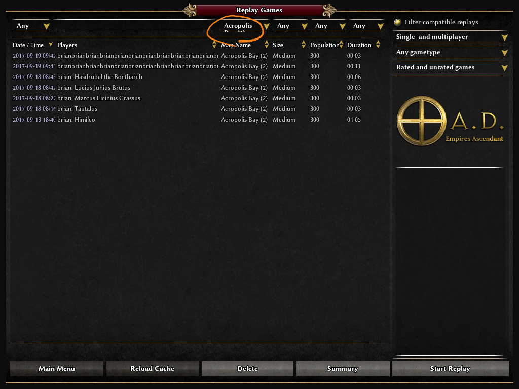
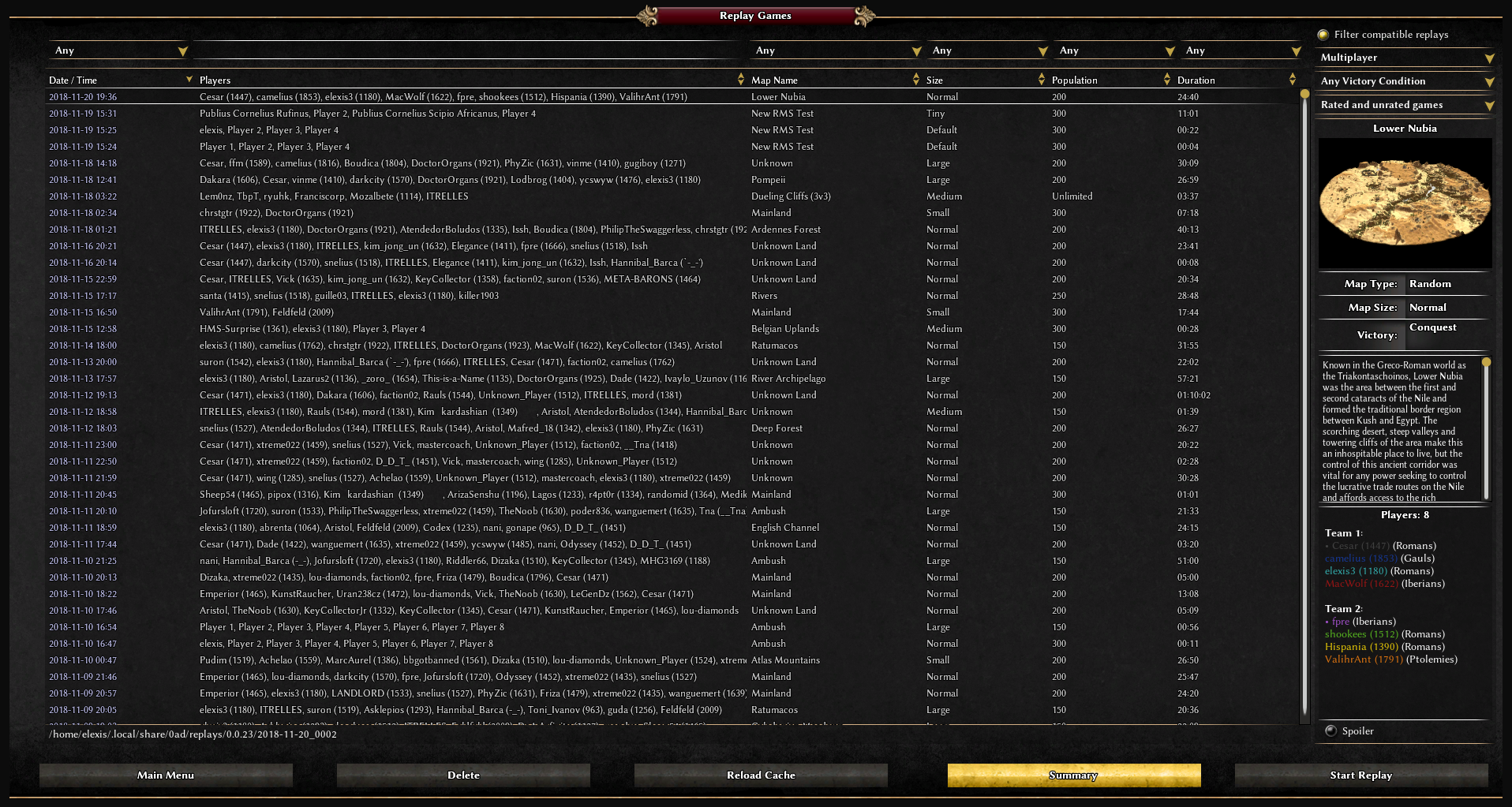
Page MenuHomeWildfire Games

Improves the replay list interface
Needs RevisionPublic

Authored by vladislavbelov on Nov 7 2017, 10:22 PM.

Details

Reviewers
wraitii
Group Reviewers
Restricted Owners Package(Owns No Changed Paths)
Summary

Comparison:

BeforeAfterAfter (nothing selected)

Why the Summary button logic was changed?
Because Delete and Start replay buttons are only disabled, but the Summary button is hidden. It looks weird.

Why Delete and Reload cache buttons were swapped?
Because now buttons are grouped by types: common buttons (main menu, reload cache), replay buttons (delete, summary, start).

Why the padding was changed?
Because now most elements are aligned a grid.

Test Plan
  1. Run the game
  2. Open the replay list
  3. Check that it works as before the patch (except visibility of the summary button)

Diff Detail

Event Timeline

vladislavbelov created this revision.Nov 7 2017, 10:22 PM
Vulcan added a subscriber: Vulcan.Nov 7 2017, 11:04 PM
Executing section Default...
Executing section Source...
Executing section JS...

Successful build - Chance fights ever on the side of the prudent.

Updating workspaces...
Build (release)...
Build (debug)...
Running release tests...
Running cxxtest tests (307 tests)...................................................................................................................................................................................................................................................................................................................OK!
Running debug tests...
Running cxxtest tests (307 tests)...................................................................................................................................................................................................................................................................................................................OK!
Checking XML files...
Imarok added a subscriber: Imarok.Nov 8 2017, 1:59 AM

Looks nice, besides the buttons: They are huge in fullscreen on a Full-HD monitor. So I think a constant size would be better. Also the gap between two buttons is too small for my perception.
How it looks in Full-HD fullscreen:

elexis added a subscriber: elexis.Nov 8 2017, 10:47 AM

(We also discussed moving to the red buttons in https://wildfiregames.com/forum/index.php?/topic/22791-replace-stone-buttons-with-red-ones/ in caes you want to go for that)

In D1023#40081, @elexis wrote:

(We also discussed moving to the red buttons in https://wildfiregames.com/forum/index.php?/topic/22791-replace-stone-buttons-with-red-ones/ in caes you want to go for that)

Yeah, I saw it. I have thoughts, I'll make a post at the weekend about the GUI style.

In D1023#40067, @Imarok wrote:

Looks nice, besides the buttons: They are huge in fullscreen on a Full-HD monitor. So I think a constant size would be better. Also the gap between two buttons is too small for my perception.

Ok, I'll try it.

Use absolute widths.

Vulcan added a comment.Nov 8 2017, 9:39 PM

Successful build - Chance fights ever on the side of the prudent.

Updating workspaces...
Build (release)...
Build (debug)...
Running release tests...
Running cxxtest tests (307 tests)...................................................................................................................................................................................................................................................................................................................OK!
Running debug tests...
Running cxxtest tests (307 tests)...................................................................................................................................................................................................................................................................................................................OK!
Checking XML files...
Vulcan added a comment.Nov 8 2017, 9:40 PM
Executing section Default...
Executing section Source...
Executing section JS...
temple added a subscriber: temple.EditedNov 8 2017, 9:56 PM

I've been looking at a couple changes in general, so I thought I'd mention them.


The first is in a lot of the scroll boxes the text goes over the bottom bar. This can be fixed by adjusting the z-value in the associated sprite.
The second is the black border around the scrollbar, which looks kind of weird. In dropdown scrollbars it looks fine, because the dropdown has a black border too. But for regular scrollbars it looks out of place, to me anyway. We can create another scrollbar to fix this, but there's still problems with the dropdowns because the text can cover the black borders.

binaries/data/mods/public/gui/replaymenu/replay_menu.xml
32

Should use absolute height too, there seems to be some kind of bug with relative heights.

(That text of the table (COList.cpp) is rendered above the sprite is hardcoded in that c++ file IIRC. If that can be fixed with a z index please upload a diff, but until now multiple people left that issue with annoyance)

binaries/data/mods/public/gui/replaymenu/replay_menu.xml
32

You mean not using percent numbers in the size property means that the text wrapping of the list item won't be noticeable? Sure about this?

temple added inline comments.Nov 10 2017, 5:45 PM
binaries/data/mods/public/gui/replaymenu/replay_menu.xml
32

The text wrapping will still be noticeable, but I mean that it won't extend beyond the gold bar anymore.

In D1023#40118, @temple wrote:

I've been looking at a couple changes in general, so I thought I'd mention them.
The first is in a lot of the scroll boxes the text goes over the bottom bar. This can be fixed by adjusting the z-value in the associated sprite.
The second is the black border around the scrollbar, which looks kind of weird. In dropdown scrollbars it looks fine, because the dropdown has a black border too. But for regular scrollbars it looks out of place, to me anyway. We can create another scrollbar to fix this, but there's still problems with the dropdowns because the text can cover the black borders.

These things should be fixed in the C++ part, as elexis mentioned. Not in GUI style things.

binaries/data/mods/public/gui/replaymenu/replay_menu.xml
32

I had an idea to not wrap and make a clip, if a drowdown is a one line. But it's C++ part, so not in this diff.

This is what I had in mind.

Index: binaries/data/mods/mod/gui/common/modern/sprites.xml
===================================================================
--- binaries/data/mods/mod/gui/common/modern/sprites.xml	(revision 20434)
+++ binaries/data/mods/mod/gui/common/modern/sprites.xml	(working copy)
@@ -221,6 +221,7 @@
 		<image texture = "global/modern/gold-separator.png"
 			real_texture_placement = "0 0 806 1"
 			size = "0 100%-1 100% 100%"
+			z_level = "15"
 		/>
 		<image backcolor = "12 12 12 100"
 			size = "0 0 100% 100%-1"

In D1023#40247, @temple wrote:

This is what I had in mind.

Index: binaries/data/mods/mod/gui/common/modern/sprites.xml
===================================================================
--- binaries/data/mods/mod/gui/common/modern/sprites.xml	(revision 20434)
+++ binaries/data/mods/mod/gui/common/modern/sprites.xml	(working copy)
@@ -221,6 +221,7 @@
 		<image texture = "global/modern/gold-separator.png"
 			real_texture_placement = "0 0 806 1"
 			size = "0 100%-1 100% 100%"
+			z_level = "15"
 		/>
 		<image backcolor = "12 12 12 100"
 			size = "0 0 100% 100%-1"

It's a hack, I think, it's better to make clip for the element.

If it only needs a COList.cpp change, it should be easy. IIRC fpre / ffffffff had a WIP diff for that somewhere.

In D1023#40251, @elexis wrote:

If it only needs a COList.cpp change, it should be easy.

Yep.

IIRC fpre / ffffffff had a WIP diff for that somewhere.

Good news!

wraitii requested changes to this revision.Dec 3 2017, 6:19 PM
This revision now requires changes to proceed.Dec 3 2017, 6:19 PM

I agree that this looks ugly in

, for 1600*1200 it already looks like a grid:

I suppose the math wasn't done right to always have the grid.

Some buttons hidden, others disabled if no replay is selected

Good catch! (Historic reasons...)

Button swap makes sense.

So basically the patch advertizement is accepted, the other things mentioned here are offtopic, code looks okay, but I don't want to test it nor want to look at the size math (so I can't tell whether it actually implements what it claims to). So you could commit as agreed with me or something (some word X where nothing < X < review) if you think the numbers are better (and if they actually are for all relevant window sizes).

We also want to use the Red buttons, so all GUI pages use the same button style (although I found/find grey ones more appealing sometimes) (the patch can be considered one of multiple independent improvements of something that is free of big defects.)

(We should have a ticket and a good reference to this patch with regards to the golden bar thing)

In D1023#66466, @elexis wrote:

We also want to use the Red buttons, so all GUI pages use the same button style (although I found/find grey ones more appealing sometimes) (the patch can be considered one of multiple independent improvements of something that is free of big defects.)
(We should have a ticket and a good reference to this patch with regards to the golden bar thing)

I agree, we need to define something like a UI conventions, what & where & which elements do we use in different cases.