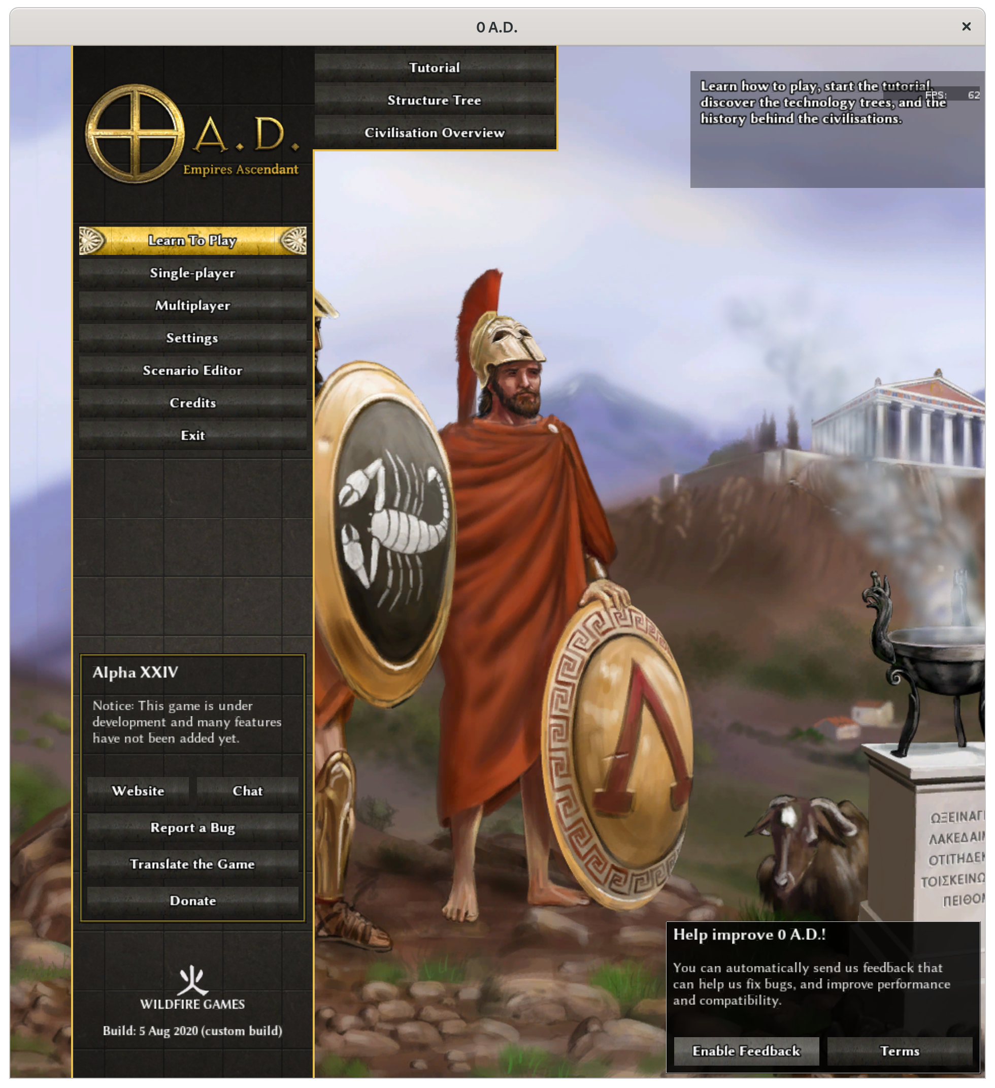
As discussed in rP23387, there is some unnecessary empty space in the pre-game main menu, between the 0 A.D. logo and the “Learn To Play” button.
This patch removes that, so it looks better on 1280×720 screens.
Before:
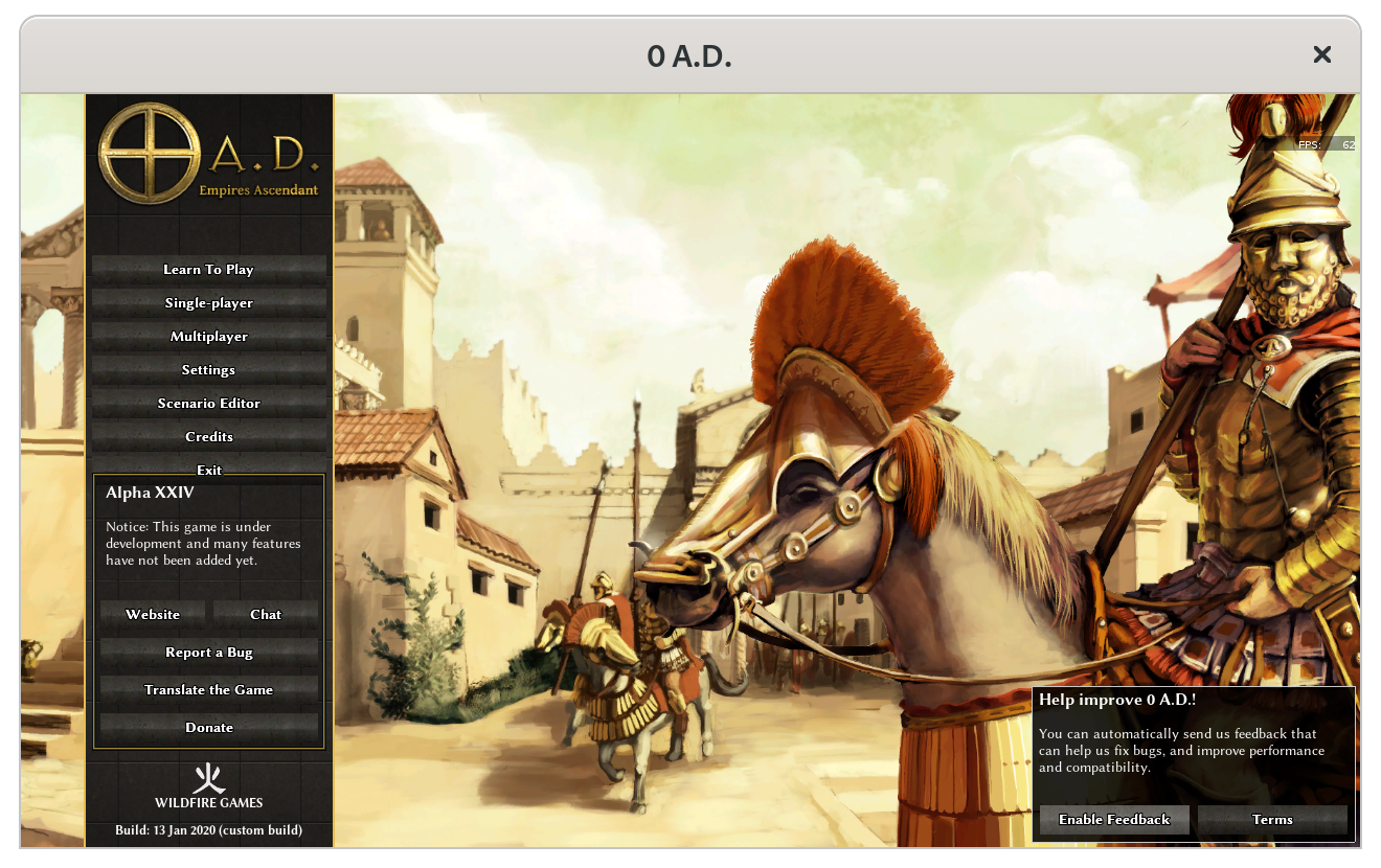
After:

On 3840×2160:

Differential D2568
[gui] remove empty space between logo and buttons Authored by Nescio on Jan 14 2020, 6:16 PM.
Details
As discussed in rP23387, there is some unnecessary empty space in the pre-game main menu, between the 0 A.D. logo and the “Learn To Play” button. After: On 3840×2160: Apply the patch, observe nothing breaks, agree this is a minor improvement.
Diff Detail
Event TimelineComment Actions Successful build - Chance fights ever on the side of the prudent. Link to build: https://jenkins.wildfiregames.com/job/vs2015-differential/1035/display/redirect Comment Actions Successful build - Chance fights ever on the side of the prudent. Link to build: https://jenkins.wildfiregames.com/job/macos-differential/131/display/redirect Comment Actions Successful build - Chance fights ever on the side of the prudent. Link to build: https://jenkins.wildfiregames.com/job/docker-differential/1553/display/redirect Comment Actions
Because you're friendly and helpful? Comment Actions Should optimize the solution for the user, not for the developer, and it looks more appealing if it is vertically centered, which is relevant for all resolutions greater than that one? (Also, not that it matters for these three characters, but crediting isn't wrong when distributing patches) Comment Actions
Personally I think top alignment looks best, but I'm biased, of course. Here's how it looks on 3840×2160: For comparison, this is how it looks with size="8 50%-100 100%-8 50%+100" on 3840×2160: 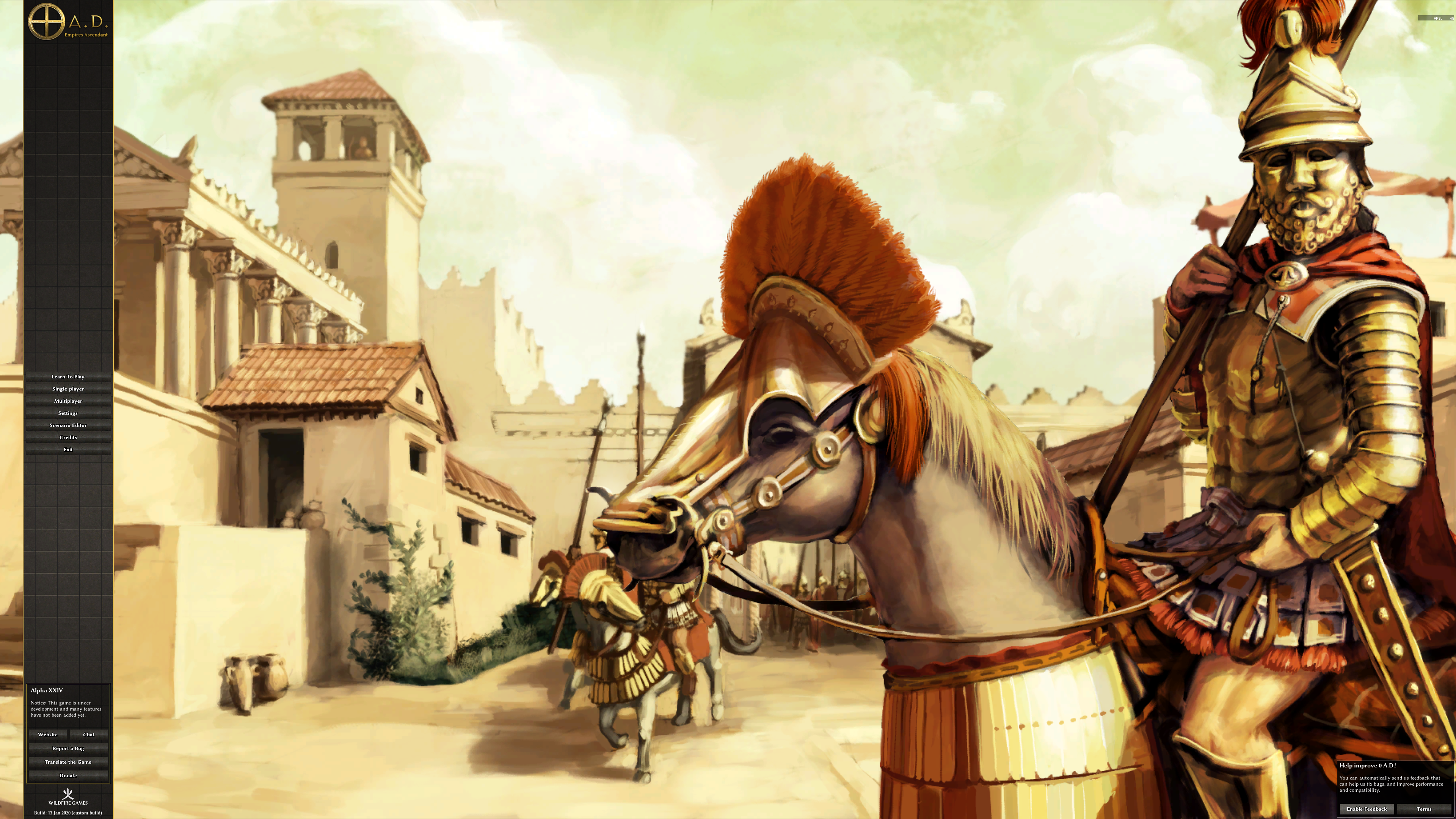 Undoubtedly something neater could be achieved with JavaScript, but I'm not a programmer, so what's easy and straightforward for you isn't necessarily for me. XML at least I understand.
I apologize if I did something wrong. What do you mean exactly? Comment Actions
This is the patch I uploaded at https://code.wildfiregames.com/rP23387#40853 so it would be correct to credit that. Perhaps it would look best Perhaps it would look best if the space between the top of the window and the product logo, between the product logo and the mainmenu buttons, and between the main menu buttons and the top of the project info box, and the bottom of the project info box and the bottom of the window would be divided uniformly? Comment Actions
Again, I'm not sure what you mean, the summary already starts with “As discussed in rP23387”. Or did you mean you want your username explicitly mentioned? (No problem!)
I suppose I could try out how that would look, although I don't think floating elements would be an improvement. Comment Actions Yes. (I don't care about this one line changed here, just in general. Discussion != patch)
Regardless of the implementation, the productLogo would need to be moved to a different parent object.
One could make a mockup with different size numbers and then decide if it looks better or not (for 3840×2160). Actually another possibility would be to use percent numbers. So perhaps one can use something like 10% +/- offset for the product logo, so that its not aligned at the utter top for large resolutions, only for small ones. (Its quite boring to compute / implement, so I guess one can also argue with the best implementation being too boring to implement and this one being the best one that is feasible given motivation.) Comment Actions
Do you mean the 0 A.D. at the top or the Wildfire Games at the bottom?
(The idea was actually to improve things for 1280×720; if it works for a small screen, it typically works for a higher resolution as well; the reverse is not true; anyway, I'll do some tinkering with the numbers and see what I can get.) Comment Actions
This is what you meant, right?  I still think sticking with top-down and bottom-up looks better. Comment Actions Perhaps the logo can be moved something like 25-100px depending on resolution, perhaps a percent number to the bottom, and then some margin to the buttons? Something like this? 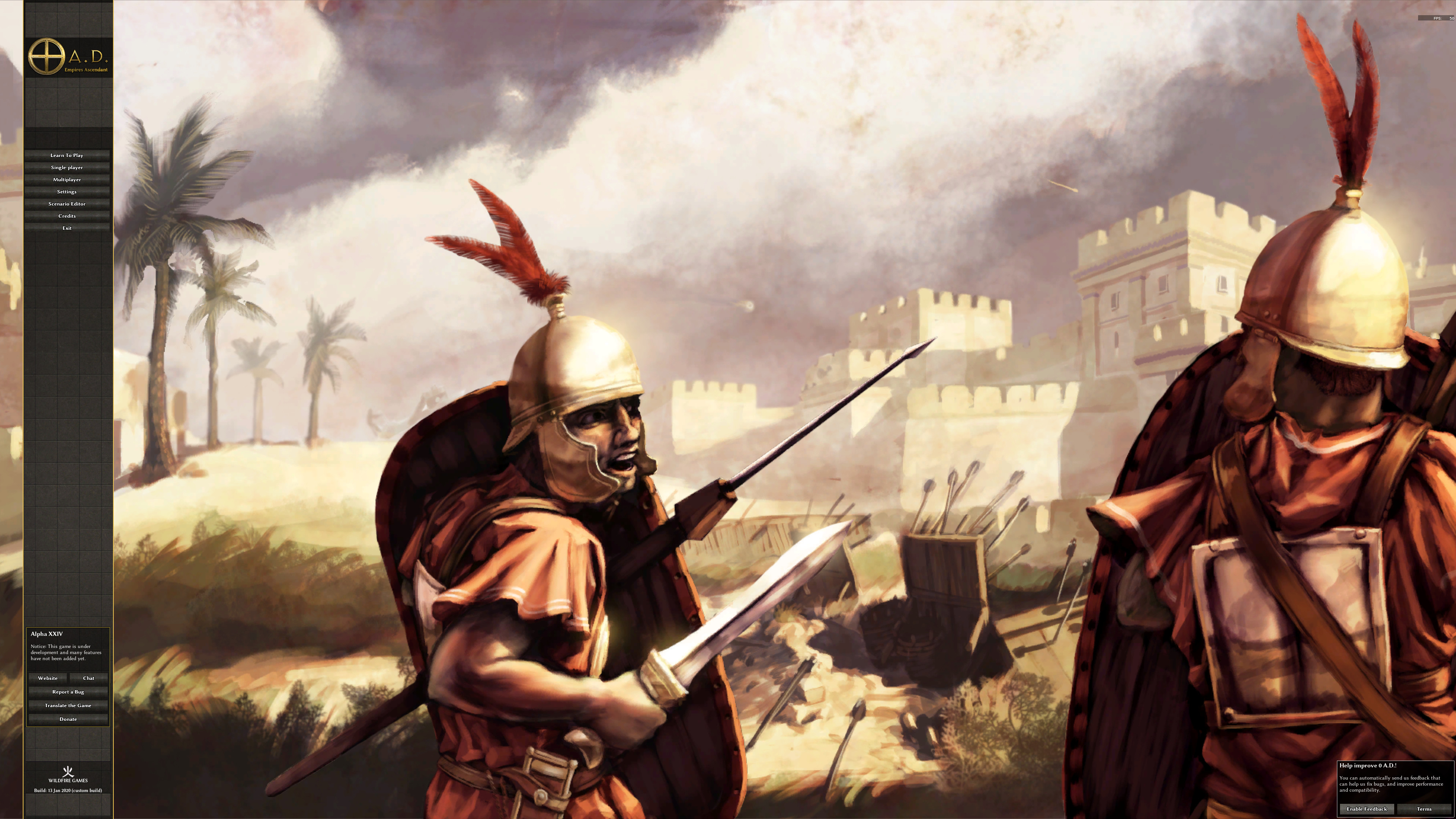 Comment Actions Perhaps it's easier if you'd state the percentages how you'd like to distribute the empty space? (The total vertical space currently required is 684 (100 for the logo, 200 for the buttons, 266 for the project box, 48 for the organization, and 36 for the product build), which leaves 36 at 1280×720, 396 at 1920×1080, and 1476 at 3840×2160.) Comment Actions Successful build - Chance fights ever on the side of the prudent. Link to build: https://jenkins.wildfiregames.com/job/docker-differential/1620/display/redirect Comment Actions
(Finding good numbers would take some time, and to me its currently not broken.) I would keep the organization logo and build information grouped, otherwise looks ok to me (and the product logo offset looks better than not having it so this iteration improves that). (Also equations like -144+120 should be computed) Comment Actions
Yes, I understand, I meant some approximate mock-up values.
Actually I kept those intentionally: the third number is the position at 720 pixels, since the second number cancels out the percentage.
So E is 0% and C is 60%?
(I still think the original diff looks best.) Comment Actions Successful build - Chance fights ever on the side of the prudent. Link to build: https://jenkins.wildfiregames.com/job/docker-differential/1639/display/redirect Comment Actions
|