Page MenuHomeWildfire Games

[gui] shrink selection panel icons
ClosedPublic

Authored by Nescio on Jul 12 2020, 9:58 PM.

Details

Reviewers
genava55
Silier
Group Reviewers
Restricted Owners Package(Owns No Changed Paths)
Commits
rP24028: Shrink selection panel icons
Summary

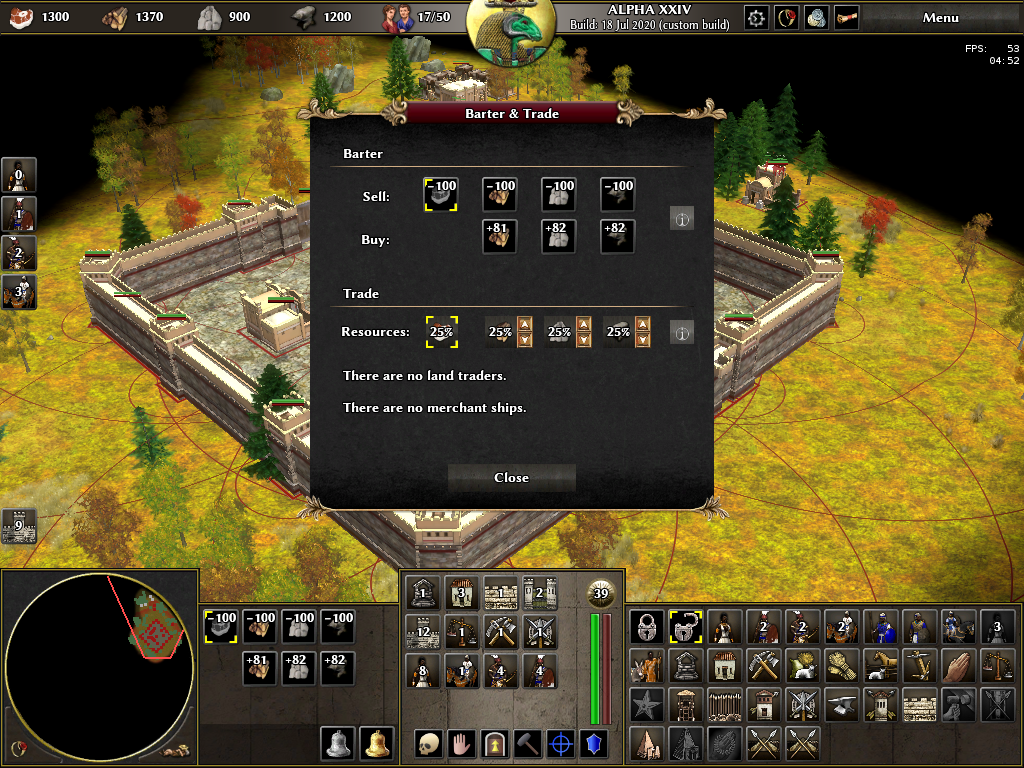
This patch is an alternative to D2806. Instead of increasing the size of the right selection panel to have an additional row, this patch reduces the size of the icons (from 40 to 32 pixels), to be able to display more entities (4 × 10 = 40 instead of 3 × 8 = 24).
The advantage is that this allows for future additions and mods, while not taking up more space, which is especially important on low resolution screens.
The disadvantage is that due to their smaller sizes, the icons become slightly harder to identify, especially on high resolution screens.

See also https://wildfiregames.com/forum/index.php?/topic/28525-larger-panel-or-smaller-icons/&tab=comments#comment-401080

Related: D2051.

[EDIT] Further changes for consistency and visual harmony:

  • Mini-map gets exactly the same height as middle selection panel.
  • Selection group, technology research progress, and barter and trade resource icons are all standardized to 32×32 pixels too.
  • Icons in left selection panel are shrunk to 32×32 pixels too.
  • Left selection panel supports up to 15 formation types.
  • Left selection panel supports up to 5 resource types.
  • Left, middle, and right selection panels have the same margin between the icons and panel border.
  • Command icons (middle panel) have their centre vertically aligned with the bottom row of the left and right selection panels.
  • Rather than extending over and beyond the panel borders, the “big unit icon” is now moved inside the middle panel; its size is unchanged (96×96 pixels). This was necessary to be able to display five columns in the left selection panel (e.g. formations).

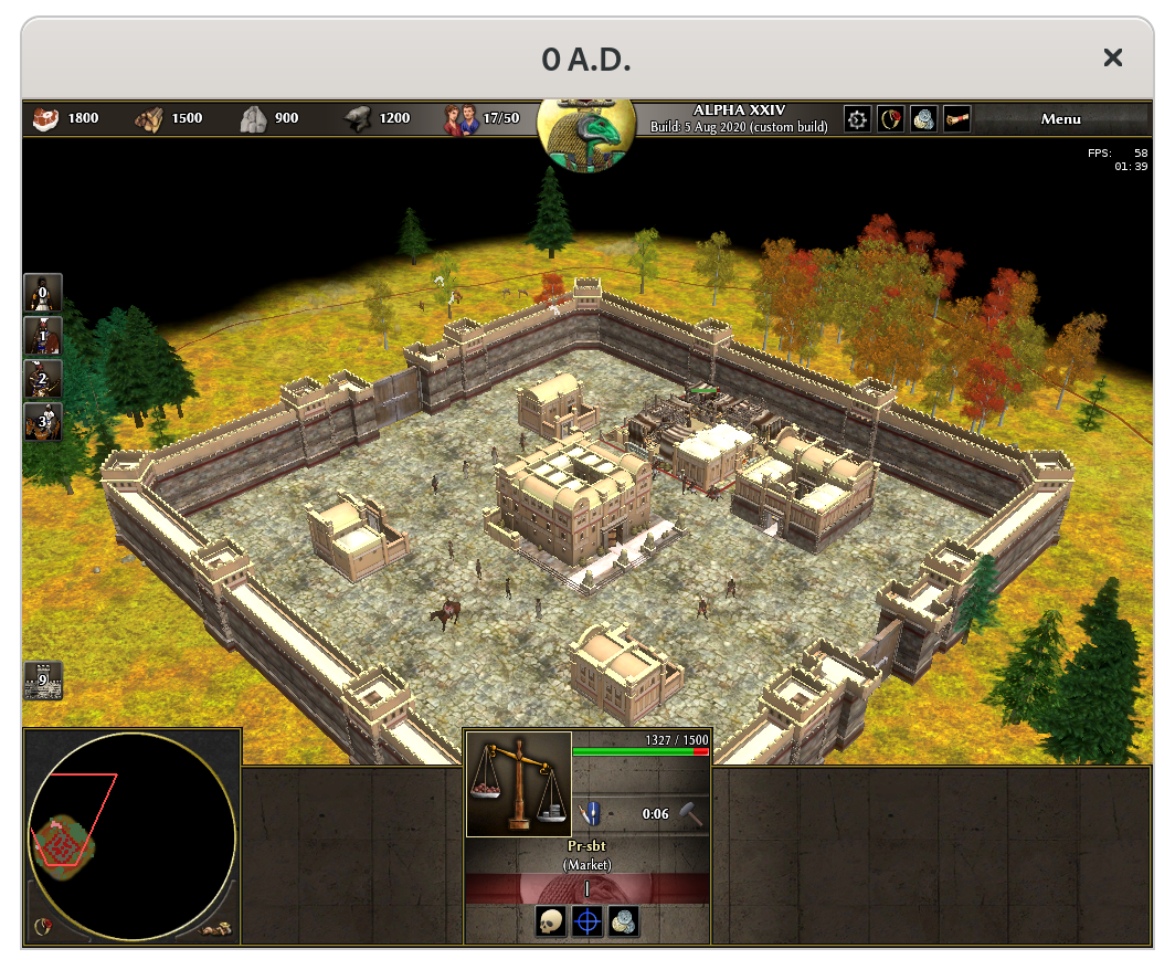
How it looks in game at minimum resolution (1024×768):

Test Plan

Check for completeness and correctness.

Diff Detail

Repository
rP 0 A.D. Public Repository
Lint
Automatic diff as part of commit; lint not applicable.
Unit
Automatic diff as part of commit; unit tests not applicable.

Event Timeline

There are a very large number of changes, so older changes are hidden. Show Older Changes
Nescio added inline comments.Jul 20 2020, 8:47 PM
binaries/data/mods/public/gui/session/selection_panels_left/formation_panel.xml
2 ↗(On Diff #12825)

For symmetry. See file above.

binaries/data/mods/public/gui/session/selection_panels_left/garrison_panel.xml
2 ↗(On Diff #12825)

Idem.

binaries/data/mods/public/gui/session/selection_panels_middle/multiple_details_area.xml
3 ↗(On Diff #12825)

The actual available space is defined in the session.xml. See also all other selection panel files.

5 ↗(On Diff #12825)

For symmetry.

25 ↗(On Diff #12825)

Relative numbers for more flexibility.

32 ↗(On Diff #12825)

Idem.

Nescio edited the summary of this revision. (Show Details)Jul 20 2020, 8:49 PM
Nescio updated this revision to Diff 12826.Jul 20 2020, 8:57 PM
  • minimap
Nescio added inline comments.Jul 20 2020, 9:00 PM
binaries/data/mods/public/gui/session/minimap/MiniMap.xml
4 ↗(On Diff #12826)

The available space is defined in session.xml.

binaries/data/mods/public/gui/session/session.xml
74–76 ↗(On Diff #12826)

This is done for consistency, to make things more obvious, and more importantly, if in the future (or a mod) someone wants to resize or move around the selection panels, they only need the session.xml file.

Successful build - Chance fights ever on the side of the prudent.

Linter detected issues:
Executing section Source...
Executing section JS...
|    | [NORMAL] ESLintBear (no-multi-spaces):
|    | Multiple spaces found before 'state'.
|----|    | /zpool0/trunk/binaries/data/mods/public/gui/session/selection_panels.js
|    |++++| /zpool0/trunk/binaries/data/mods/public/gui/session/selection_panels.js
| 299| 299| 		if (!g_AvailableFormations.has(unitEntStates[0].player))
| 300| 300| 			g_AvailableFormations.set(unitEntStates[0].player, Engine.GuiInterfaceCall("GetAvailableFormations", unitEntStates[0].player));
| 301| 301| 
| 302|    |-		return g_AvailableFormations.get(unitEntStates[0].player).filter(formation => unitEntStates.some(state => !!state.identity &&  state.identity.formations.indexOf(formation) != -1));
|    | 302|+		return g_AvailableFormations.get(unitEntStates[0].player).filter(formation => unitEntStates.some(state => !!state.identity && state.identity.formations.indexOf(formation) != -1));
| 303| 303| 	},
| 304| 304| 	"setupButton": function(data)
| 305| 305| 	{
|    | [NORMAL] ESLintBear (space-before-function-paren):
|    | Unexpected space before function parentheses.
|----|    | /zpool0/trunk/binaries/data/mods/public/gui/session/selection_panels.js
|    |++++| /zpool0/trunk/binaries/data/mods/public/gui/session/selection_panels.js
| 765| 765| 				addResearchToQueue(data.item.researchFacilityId, t);
| 766| 766| 			})(tech);
| 767| 767| 
| 768|    |-			button.onPressRight = (t => function () {
|    | 768|+			button.onPressRight = (t => function() {
| 769| 769| 				showTemplateDetails(
| 770| 770| 					t,
| 771| 771| 					GetTemplateData(data.unitEntStates.find(state => state.id == data.item.researchFacilityId).template).nativeCiv);

binaries/data/mods/public/gui/session/selection_panels.js
|  50| »   »   »   switch·(data.item)
|    | [NORMAL] ESLintBear (default-case):
|    | Expected a default case.

binaries/data/mods/public/gui/session/selection_panels.js
|  61| »   »   switch·(data.item)
|    | [NORMAL] ESLintBear (default-case):
|    | Expected a default case.

binaries/data/mods/public/gui/session/selection_panels.js
| 733| »   »   »   »   »   »   switch·(entity.check)
|    | [NORMAL] ESLintBear (default-case):
|    | Expected a default case.
Executing section cli...

Link to build: https://jenkins.wildfiregames.com/job/docker-differential/2735/display/redirect

@wraitii, according to this poll, there is a clear majority (70%) favouring this approach (shrinking icons) over the alternative (D2806, increasing panel size).

Nescio added inline comments.Jul 23 2020, 12:08 PM
binaries/data/mods/public/gui/session/selection_panels_middle/unit_ally_commands.xml
16–17 ↗(On Diff #12826)

Does nothing and has a vertical size of 0.

binaries/data/mods/public/gui/session/selection_panels_middle/unit_commands.xml
16–17 ↗(On Diff #12826)

Idem.

wraitii added a subscriber: Stan.Jul 25 2020, 11:32 AM

I like this better than the alternative, graphics wise.

However, I think you should make the spacing between this tab, the selection tab and the formation tab identical. The margins are different right now and it looks odd.
A slightly larger spacing between icons wouldn't hurt, so maybe remove one column? I think consistency would be best.

We might need to revamp the icons though, as the downscaling makes them rather ugly :/
@Stan opinions?

Well, I did update and expand this patch on Monday to include the other selection panels as well, so now the icon sizes and the spaces between the icons is identical. (It seems I forgot replacing the screenshot in the summary).

Well, I did update and expand this patch on Monday to include the other selection panels as well, so now the icon sizes and the spaces between the icons is identical. (It seems I forgot replacing the screenshot in the summary).

I'm talking about the margins around the icons, actually.

Nescio planned changes to this revision.Jul 25 2020, 11:44 AM

I'm talking about the margins around the icons, actually.

That could be easily changed too.

I'm talking about the margins around the icons, actually.

To be clear, do you mean the margins around the icons as a whole (i.e. between them and the panel borders), or the margins between individual icons (not changed)?

I'm talking about the margins around the icons, actually.

To be clear, do you mean the margins around the icons as a whole (i.e. between them and the panel borders), or the margins between individual icons (not changed)?

The first. Indeed it's an easy change :)

Stan added a comment.Jul 25 2020, 12:06 PM

I wonder if you should reduce the bells icons on the left as well, so that all icons are the same size.

Nescio updated this revision to Diff 12937.Jul 27 2020, 1:37 PM
Nescio retitled this revision from [gui] shrink right selection panel icons to [gui] shrink selection panel icons.
Nescio edited the summary of this revision. (Show Details)
  • further standardizations of icon sizes and margins
Nescio edited the summary of this revision. (Show Details)Jul 27 2020, 1:38 PM

I wonder if you should reduce the bells icons on the left as well, so that all icons are the same size.

Actually they already are. The reason why the looked larger is because the command icons in the middle panel are slightly smaller. While most icons are 32×32 and are surrounded by a border of 3 pixels on each side, the command icons in the middle panel are 32×32 too, but have the border on top of the icon, instead of around it, like the others. Changing them to be the same as the other icons is not possible, unfortunately, because the middle panel is not wide enough to have six icons + borders.

Successful build - Chance fights ever on the side of the prudent.

Linter detected issues:
Executing section Source...
Executing section JS...
|    | [NORMAL] ESLintBear (no-multi-spaces):
|    | Multiple spaces found before 'state'.
|----|    | /zpool0/trunk/binaries/data/mods/public/gui/session/selection_panels.js
|    |++++| /zpool0/trunk/binaries/data/mods/public/gui/session/selection_panels.js
| 299| 299| 		if (!g_AvailableFormations.has(unitEntStates[0].player))
| 300| 300| 			g_AvailableFormations.set(unitEntStates[0].player, Engine.GuiInterfaceCall("GetAvailableFormations", unitEntStates[0].player));
| 301| 301| 
| 302|    |-		return g_AvailableFormations.get(unitEntStates[0].player).filter(formation => unitEntStates.some(state => !!state.identity &&  state.identity.formations.indexOf(formation) != -1));
|    | 302|+		return g_AvailableFormations.get(unitEntStates[0].player).filter(formation => unitEntStates.some(state => !!state.identity && state.identity.formations.indexOf(formation) != -1));
| 303| 303| 	},
| 304| 304| 	"setupButton": function(data)
| 305| 305| 	{
|    | [NORMAL] ESLintBear (space-before-function-paren):
|    | Unexpected space before function parentheses.
|----|    | /zpool0/trunk/binaries/data/mods/public/gui/session/selection_panels.js
|    |++++| /zpool0/trunk/binaries/data/mods/public/gui/session/selection_panels.js
| 765| 765| 				addResearchToQueue(data.item.researchFacilityId, t);
| 766| 766| 			})(tech);
| 767| 767| 
| 768|    |-			button.onPressRight = (t => function () {
|    | 768|+			button.onPressRight = (t => function() {
| 769| 769| 				showTemplateDetails(
| 770| 770| 					t,
| 771| 771| 					GetTemplateData(data.unitEntStates.find(state => state.id == data.item.researchFacilityId).template).nativeCiv);

binaries/data/mods/public/gui/session/selection_panels.js
|  50| »   »   »   switch·(data.item)
|    | [NORMAL] ESLintBear (default-case):
|    | Expected a default case.

binaries/data/mods/public/gui/session/selection_panels.js
|  61| »   »   switch·(data.item)
|    | [NORMAL] ESLintBear (default-case):
|    | Expected a default case.

binaries/data/mods/public/gui/session/selection_panels.js
| 733| »   »   »   »   »   »   switch·(entity.check)
|    | [NORMAL] ESLintBear (default-case):
|    | Expected a default case.
Executing section cli...

Link to build: https://jenkins.wildfiregames.com/job/docker-differential/2790/display/redirect

Nescio edited the summary of this revision. (Show Details)Jul 27 2020, 1:48 PM
Nescio added inline comments.Jul 27 2020, 1:53 PM
binaries/data/mods/public/gui/session/selection_panels.js
82–84 ↗(On Diff #12937)

Because there is now enough space for this.

287–289 ↗(On Diff #12937)

Three rows of five makes fifteen.
The former value was wrong, a fourth row would occupy the space used by the stance icons.

339–341 ↗(On Diff #12937)

This is not changed to a row length of 5, because then there is not enough space for the health bar.

binaries/data/mods/public/gui/session/selection_panels_left/garrison_panel.xml
3 ↗(On Diff #12937)

The 20 (not 6) is intentional, otherwise the health bar (line 15) would be placed on top of the map panel.

genava55 accepted this revision.Aug 8 2020, 9:15 AM
genava55 added a subscriber: genava55.

I tried the revision. I have no issue with the size of the panel and of the icons.
If the game includes more building, then it is a necessity to apply a proposal like that.

This revision is now accepted and ready to land.Aug 8 2020, 9:15 AM
Stan added a comment.Aug 8 2020, 5:44 PM

I just tested this, why did you reduce the band with the civ emblem ? The minimap buttons no longer fit the circle (as in they have a bigger gap), the bottom bells are now bigger than previously ?

Some people already find the minimap too small, maybe you could reset back it's size and increase the middle panel one as well?

Nescio added a comment.Aug 9 2020, 9:26 AM

did you reduce the band with the civ emblem ?

You mean the top panel? I didn't touch that.

The minimap buttons no longer fit the circle (as in they have a bigger gap)

See the MiniMap.xml file. What I did is assign the minimap buttons each a width and height of 50% of the minimap panel's. It turns out they were somewhat larger before, hence the gaps.

the bottom bells are now bigger than previously ?

Initially this patch only shrunk the icons in the right selection panel, from 37×37 to 32×32 (with borders from 43×43 to 38×38). Then came the request to give the icons in the left selection panel the same size, which I did. So yes, the stance, formation, and alert icons are now slighlty larger, from 30×30 to 32×32 (with borders from 36×36 to 38×38), i.e. +1 pixel on each side.
I didn't change the size of the command icons in the bottom row of the middle panel. They're 32×32, but unlike the icons elsewhere, their border is inside (on top of) the icon, rather than around. I experimented with standardizing those too, but failed to find a satisfying solution, since their size with borders (38×38) means the middle panel is not wide enough to support six of them. Therefore I kept their sizes unchanged, but vertically aligned their centres with those on the bottom row of the left and right selection panels.

increase the middle panel one as well?

The limiting factor is everything should fit inside 1024×768. Increasing the size of a panel therefore means reducing the size of others.

Stan added a comment.Aug 9 2020, 12:11 PM

You mean the top panel? I didn't touch that.

No, I mean the player color band below the unit name.

No, I mean the player color band below the unit name.

After making screenshots both without and with the patch, I now see what you meant. It's not intentional, I'm a bit at a loss though. The player colour band is defined in `single_details_area.xml line 116, but not its size, which is apparently determined indirectly. Increasing the vertical space of its parent (line 114), grandparent (line 99) or primary ancestor (line 4) affects the height of the band, but also the vertical position of the player name and underlying civ emblem, which shouldn't be changed.

binaries/data/mods/public/gui/session/selection_panels_middle/single_details_area.xml
102–103 ↗(On Diff #12937)

unchanged

114 ↗(On Diff #12937)

unchanged

115 ↗(On Diff #12937)

This is reduced in size to avoid it overlapping the "big unit icon" or "attack and armor icon" (above). It does not affect the position or size of the overlaying player colour band (next line).

116 ↗(On Diff #12937)

The player colour band is defined here, but not its size.

Silier added a subscriber: Silier.Aug 10 2020, 1:21 PM

I havent see screnshots but this is my guess

binaries/data/mods/public/gui/session/selection_panels_middle/single_details_area.xml
4 ↗(On Diff #12937)

in combination with this

99 ↗(On Diff #12937)

and this was changed

114 ↗(On Diff #12937)

this might be not changed but 100% takes parent sizes as reference what 100% is

116 ↗(On Diff #12937)

as no sizes are given, it will just fill parent space

Nescio updated this revision to Diff 13187.Aug 14 2020, 12:14 PM
  • re-enlarge player colour band:

Nescio added inline comments.Aug 14 2020, 12:18 PM
binaries/data/mods/public/gui/session/selection_panels_middle/single_details_area.xml
117 ↗(On Diff #13187)

The civilization tooltip is moved to the (non-ghost) parent object (new line 108).
The player name is moved to same object as specific and generic names (new line 104).

Maybe an issue with leader's name of the civ (probably only with Romans)

Thank you for the report! However, that is not introduced by this patch; long player names can't be fully displayed in the current situation either:


The only solution I can think of is limiting the length of player names. However, I'm not convinced that's desirable. Regardless, it's outside the scope of this patch.

The only thing I don't like about this patch is that the player name ribbon has been reduced in height, and hence the civ icon background is not visible. That was the only small bit of civ specific UI work in the whole game. Other than that, this patch works wonderfully and should be committed.

Nescio updated this revision to Diff 13341.Aug 29 2020, 10:14 AM

Patch needs rebased after https://trac.wildfiregames.com/changeset/24001

Thanks for the heads up! Done.

The only thing I don't like about this patch is that the player name ribbon has been reduced in height, and hence the civ icon background is not visible. That was the only small bit of civ specific UI work in the whole game.

While that was true of earlier versions, the player colour band was reexpanded again two weeks ago.

Other than that, this patch works wonderfully and should be committed.

That's up to the team. @wraitii, @Stan, @Angen, others?

@wraitii, @Stan, @Angen, other team members?

Silier requested changes to this revision.Sep 6 2020, 1:41 PM
Silier added inline comments.
binaries/data/mods/public/gui/session/selection_panels_middle/single_details_area.xml
117 ↗(On Diff #13187)

this needs to be here, else you will see through panel colour around letters and not player colour

This revision now requires changes to proceed.Sep 6 2020, 1:41 PM
Nescio updated this revision to Diff 13438.Sep 6 2020, 3:03 PM
  • address player name colour mistake spotted by @Angen:

Silier added a comment.Sep 6 2020, 4:19 PM

action buttons in midle panel could be moved a bit lower,
Also player/civilisation bar is too close to entity name in brackets, for some entities it overlaps a bit. Does not happen in a23b.

Nescio added a comment.Sep 6 2020, 4:35 PM

action buttons in midle panel could be moved a bit lower,

See the summary:

Command icons (middle panel) have their centre vertically aligned with the bottom row of the left and right selection panels.

In a previous version I put them at the bottom, but it turned out it looks better if their centres are vertically aligned.

Also player/civilisation bar is too close to entity name in brackets, for some entities it overlaps a bit.

Which ones?

Silier added a comment.EditedSep 6 2020, 4:38 PM

e.g. trees, braces are a bit inside the banner

Nescio updated this revision to Diff 13444.Sep 6 2020, 4:53 PM
  • fix generic name and player colour band conflict spotted by @Angen (there was indeed a 2 pixel overlap)
Silier accepted this revision.Sep 6 2020, 5:01 PM
This revision is now accepted and ready to land.Sep 6 2020, 5:01 PM
This revision was automatically updated to reflect the committed changes.

Thanks for taking care of this @Angen :)

Nescio added a subscriber: borg-.Sep 8 2020, 10:50 AM

Thank you, @Angen, for committing this! I'm sure @wowgetoffyourcellphone, @borg-, and others appreciate it too.