[art] The final new default cursor?
Description
Description
Details
Details
- Auditors
Langbart marder - Committed
wowgetoffyourcellphone Mar 20 2022, 4:24 AM - Parents
- rP26680: [art Alpha 26] Update the footprint sizes and selectable shapes for mechanical…
- Branches
- Unknown
- Tags
- Reverted By
- D4609: Bring the old cursor back
- Build Status
Buildable 19949 Build 47850: Post-Commit Build Jenkins Build 47849: Post-Commit Build (macOS) Jenkins
Event Timeline
Comment Actions
[art] The final new default cursor?
The old one or the previous one was better, because the new one is not turned like the old ones. He just needs a little rotation, that's all.
Comment Actions
I quite like the vertical edge of this cursor. Looks clean and sharp, hence why I accepted.
One could also ask the question if the other in-game cursors shouldn't be rotated to match this angle? After playing with it a bit, I don't mind the different rotation anymore.
Comment Actions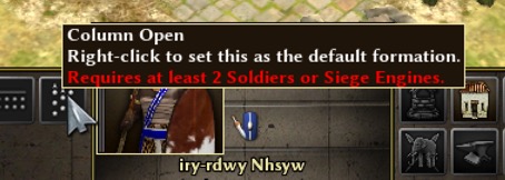
@wowgetoffyourcellphone don't do the others with this angle, this one is bad enough. It obscures too much of the icon below. All the old ones were better.
Comment Actions
Not sure I understand. Do you really think there will be issues with the recognizability of underlying icons?
To me it seems like a negligible difference between this version and one that is more turned.
(And off-topic, but I do like that it now has the same direction as the default cursor in win/macos/ubuntu ect)
Comment Actions
For some reason I feel less impressive and less real than the previous one.
It lacks volume, that is, it feels flat without depth.
The mouse should give a feeling of being a 3D object.
Thus it contrasts with the interface and the icons.
Comment Actions
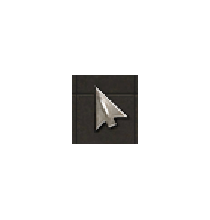
What I see in current GIT is a bit yellower, and VERY jagged. If it scaled better it would be fine, just with some minor tweaks.
#1 - Grey triangle? mediocre.
#2 - Sword, terrible to actually use as a cursor.
#3 - An arrowhead, very cool, appropriate for the game, something not quite right about it though
#4 - Arrowhead at 45 degree angle? 45 degree is for the right hand side, not the left, look at other cursors for reference.
#3 is correct, there's just something not quite right about it though. It VERY doesn't look correct at 4k though, so it's hard for me to see exactly what's weird about it.

What I see in current GIT is a bit yellower, and VERY jagged. If it scaled better it would be fine, just with some minor tweaks.
Comment Actions
The problem with the cursor in 4K seems to be a rendering issue rather than a texture issue. Perhaps someone else can verify?