This is how the civilization overviews currently look:

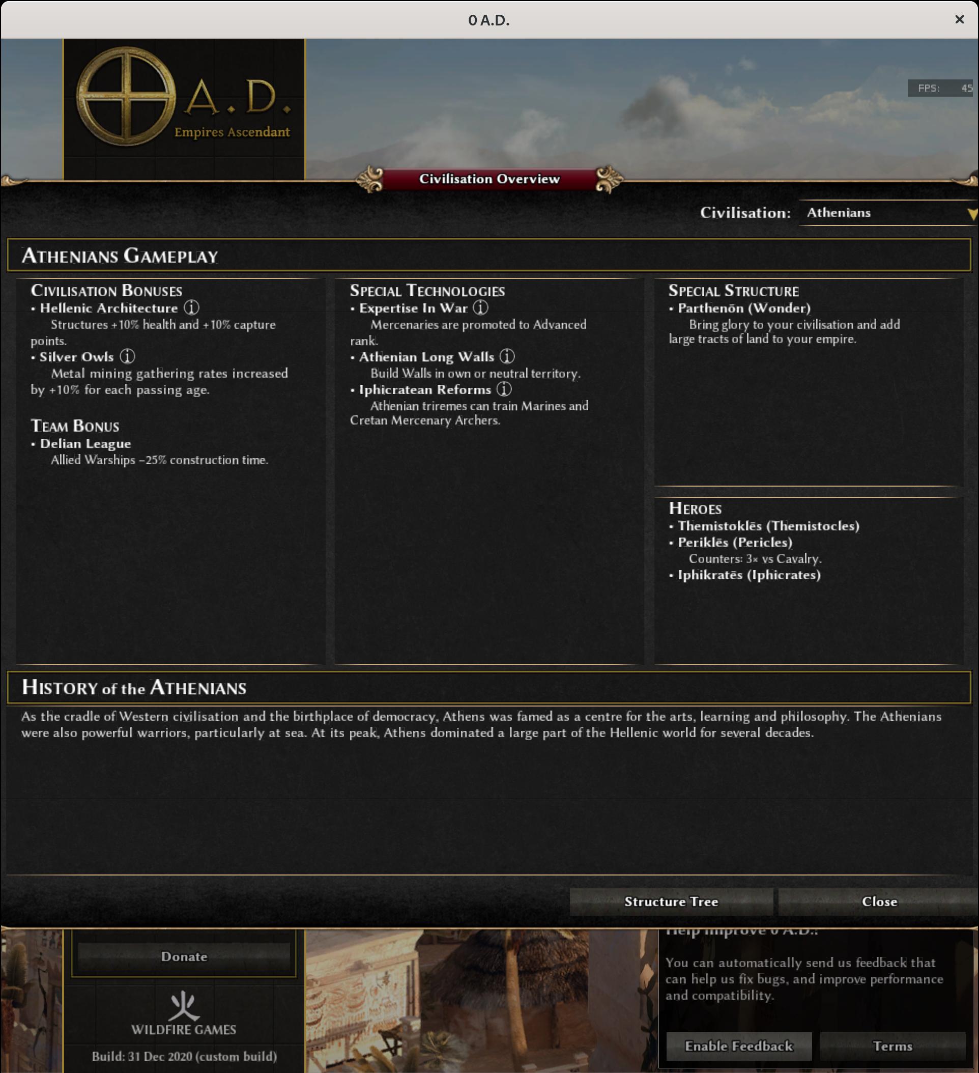
As you can see each of the columns has a different width, which looks a bit ugly. Furthermore, the third column displays both technologies, which has the most items (see e.g. pers), and structures, which can have many items too (see e.g. kush); scrollbars are ugly, especially when there is free empty space available elsewhere; by contrast, all civs have three hero entries, which doesn't take up much space vertically. Moreover, units and structures are both entities and thus conceptually more similar to each other than to technologies.
This patch resizes the columns to a width of 32% each and moves the structures to the third column:
(Having four columns looked bad, they became too narrow.)