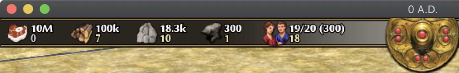
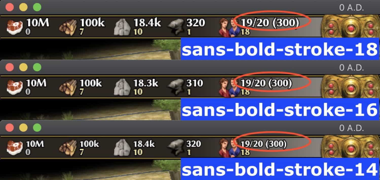
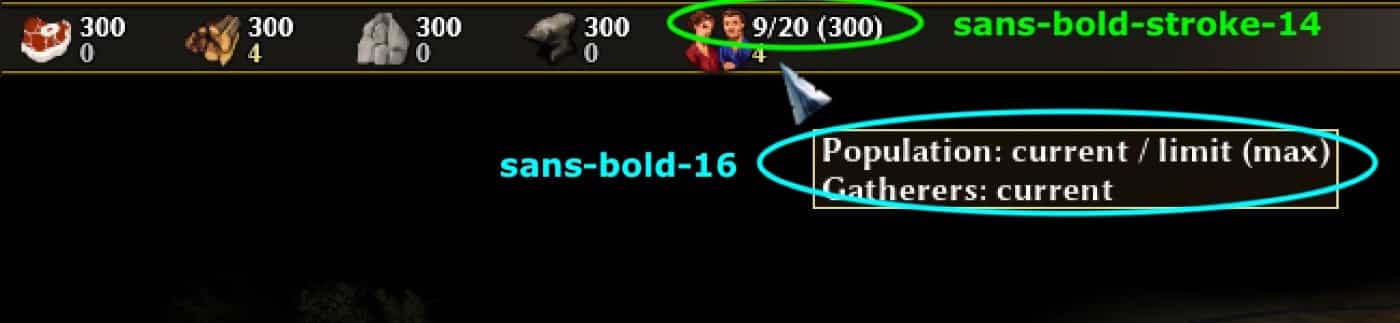
Increase font size for better visibility for the "Gatherers" number. The "Count" number for resources and the population is the same as before (sans-bold-stroke-14). The latter should be larger, but there is no sans-bold-stroke-16 and creating one with FontBuilderTool2 was discarded.
Adding a "k" or "M" to large resource numbers.
Edit1: Changed "m" to "M"
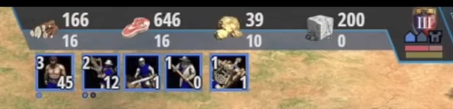
Edit2: Switched gatherer and resource number
Edit3: Changed the font to "sans-bold-stroke"
Test Plan
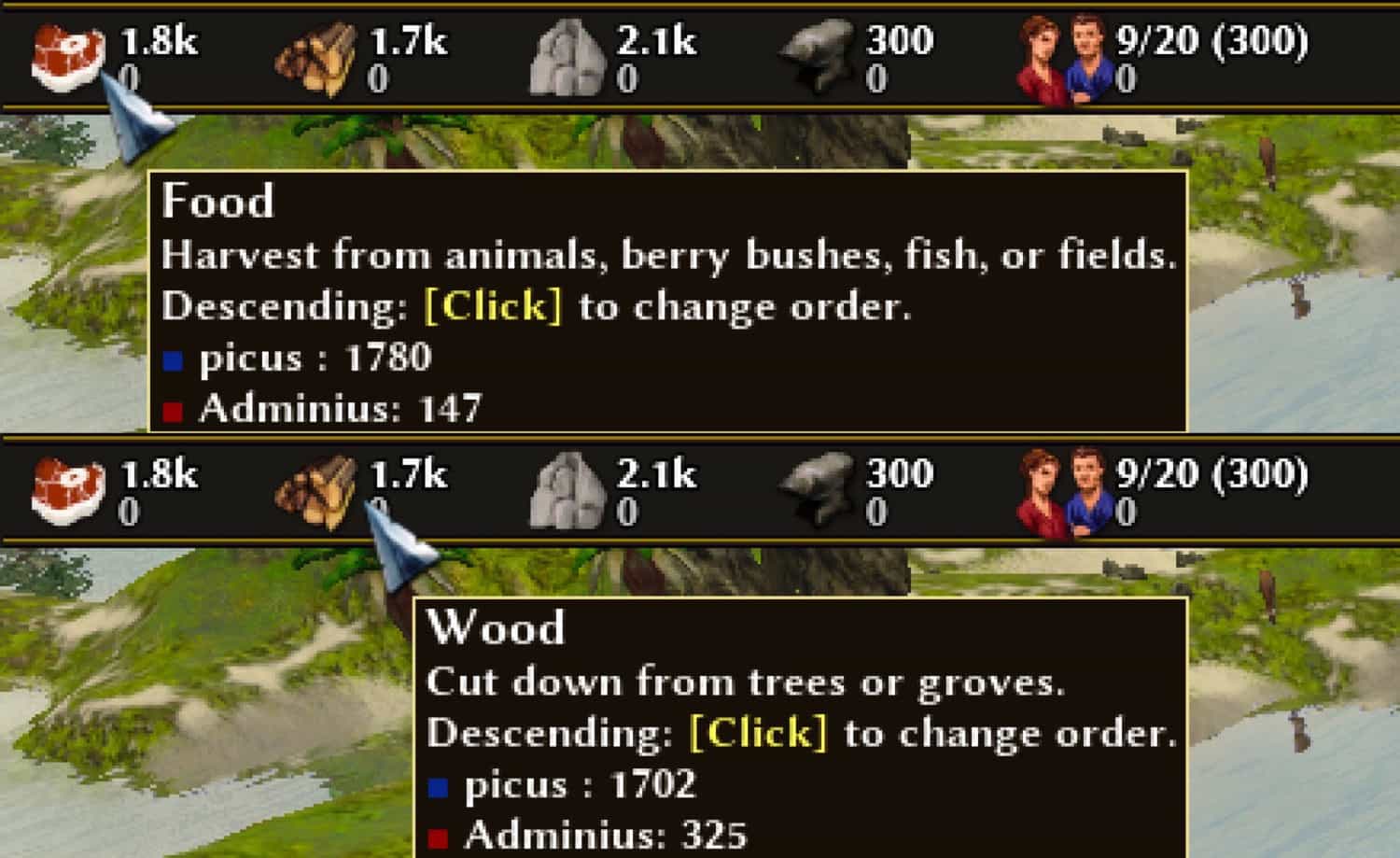
Test small amounts of resources.
Test large amounts of resources.
Agree with the style.
I was wondering, @Langbart, is there any kind of reasoning behind changing the positions of the numbers?
I always forget the PopMax and end up asking my teammates or the host of the game. Using the newly created free space in the top panel - by shortening the space for resource numbers - makes room for this additional number.
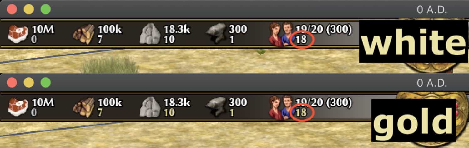
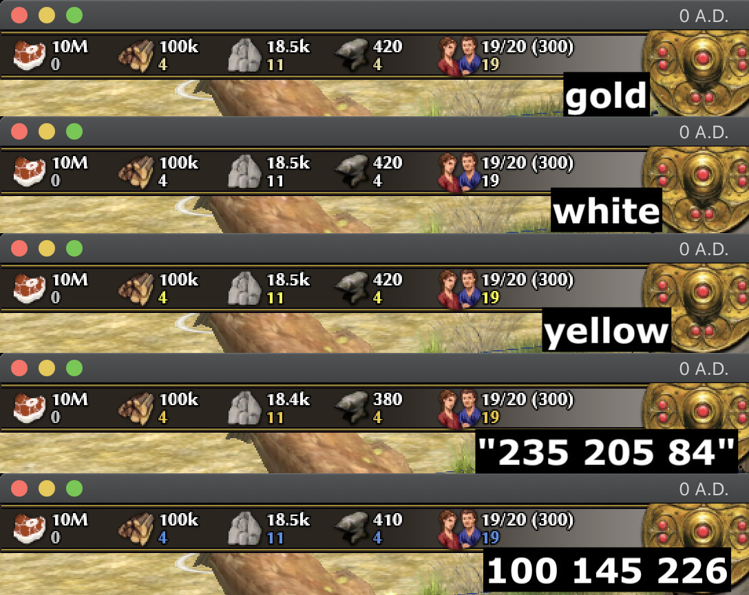
I think I'm not a fan of the # of gatherers above the resource count. I think I preferred it where it is in SVN. Barring that, I would prefer it under the resource count, not above. I'm also not a fan of the yellow color, would probably prefer something else, but that's less important.
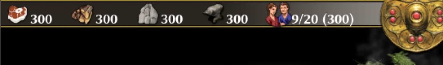
I would also prefer if the pop reads current/cap (max) instead of current/cap/max which reads like a weird date to me.
I think I'm not a fan of the # of gatherers above the resource count. I think I preferred it where it is in SVN. Barring that, I would prefer it under the resource count, not above. I'm also not a fan of the yellow color, would probably prefer something else, but that's less important.
They can sure be switched and colored in white, as shown in this image below from the popular AOE2 channel T90Official - Age Of Empires 2
I would also prefer if the pop reads current/cap (max) instead of current/cap/max which reads like a weird date to me.
They can sure be switched and colored in white, as shown in this image below from the popular AOE2 channel T90Official - Age Of Empires 2
The color is mostly that I dislike that shade of yellow. It's ugly :p.
I definitely prefer resources first, because that's the most important information here.
Change the color from "yellow" to "gold"; switch position between gatherers and resource number; changed the the layout of the CounterCaption string to count/limit (max); decreased the font size a bit and moved everything a bit to the left so there is enough space for the pop info in mimimal resolution (1024x768)
Also one may consider that people maybe would like to have a different colour for this than for the population, so I think this default colour ought to be in this specific class, not used from another class. Although one can argue that if someone wanted to change that colour it should be done in two places then.
Gave this a run. I think in general it looks good
Have to say, I'm still not feeling the gold color. I'm not sure why you want to colour it at all.
What I would do is 'sans-bold-stroke-14', as now, for the resource count (mostly because I find the lack of a stroke looks weird. Maybe we need a larger stroked font), and 'sans-bold-stroke-13' for the # of gatherers, and just leave it white.
I'd also show '0' but colour is slightly grayer (something like 200 200 200). Otherwise it seems to me there's a weird void.
Changed the name of the function from "shortLargeNumbers" to "abbreviateLargeNumbers"; Font size has been changed to "sans-bold-stroke-14 and 13"; Zeros are always present and colored in "200 200 200"; I kept the "gold" color for gatherers because it is easier to distinguish the two numbers.
I could also use the Font_Builder2 tool and create a larger font, e.g. "sans-bold-stroke-16" or "sans-bold-stroke-18".
I think there are two questions left:
(A) Should the number of resource counters be larger?
(B) Should the gatherers be colored white?
To me size 14 looks perfectly readable, and I don't think it's worth adding a custom font just for this.
I get your point that the gold color makes it more immediately differentiable, I think I just feel this very pale shade of yellow looks odd, as if there is an optical illusion of some kind. I feel like I'd prefer a light blue or something redder maybe?
I dunno, maybe it's just me.
I feel like I'd prefer a light blue or something redder maybe?
I dunno, maybe it's just me.
Red and yellow should not be used, I associate these colors with warnings or error messages. Gatheres is just a little helpful information. I think orange in "235 205 84" looks good and is sufficiently different from white and fits into the color scheme of the top panel.
I think it's either one of those colors or leave it white.
From my point of view, I would prefer size 16 and orange color because for me it creates nice readable contrast with the background. But I understand that everybody has a different perception of colors and contrast so I guess it speaks only my personal preference. Cannot much comment on code.
I originally wanted a larger font, which required a new style called "resourceTextTopPanel", but after changing the font back to "sans-bold-stroke-14", the newly created style is the same as "resourceText", so I just deleted "resourceTextTopPanel" because it's redundant.
PS: Yeah, I also would like to use "sans-bold-sroke-16" or "18" but creating a new font was dismissed.
I wonder... do we have any players from the Indian Subcontinent? (e.g. India, Pakistan, Bangladesh, Myanmar, Sri Lanka)
The reason I ask is because the folks in that region don't use the same digit groupings. What we see as "1 million" would be to them "10 lakh". Thus asking them to give a "One letter abbreviation for million" might not be something they can provide.
Then again, I'm not from that region - so perhaps finding a player that is and checking that this revision's abbreviating of numbers works for them and their locale might be worth considering.
Notice this fails when going into the negative resource amounts, but we don't support those very well, so no problem.
Also it might be a nice extension to convert really really large numbers to just their exponents (~ 1k million -> 1*10^9), but we don't really use those kind of numbers so also good for now.
I guess we do have players in the Indian Subcontinent, so maybe a forum shoutout is a good idea.
The rest of the patch looks good to me also.
Changing the note above the function "abbreviateLargeNumbers" from "Large numbers are shortened." to "@param {number} number - A number to shorten using SI prefix."
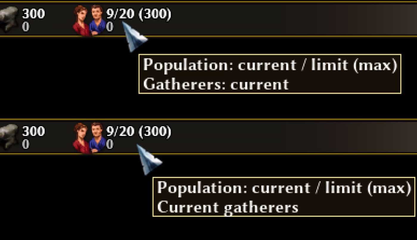
I guess these can be just Current gatherers?
Also, since it is not dynamic anymore, we can save a few function calls by storing the translated and formatted string in the prototype.
Removing "count" from the resource description tooltip.
Change "CounterPopulation.prototype.CurrentGatherersTooltip" to "this.CurrentGatherersTooltip" in CounterPopulation.js.